
Web design and development - what's the difference?
What technologies do you use to design websites?
For functionality, we use php, an open-source, commonly used scripting language that is particularly well suited to web development and that can be inserted into HTML. For Content Managed Websites we use Wordpress, an open source, online website creation tool built in php. We use HTML5, CSS3 and Javascript to develop front-end website interaction, functionality and animation. We use SQL and MYSQL wherever we need a database, and from a design perspective we use the Adobe Creative suite to create for the web.
With the increasing popularity of mobile devices, what are responsive websites and how is web design affected?
Two out of every three minutes spent online in the UK are users browsing on either a smartphone or a tablet. 13% of adults in the UK browse the internet exclusively using their smartphone, 2% more than browse exclusively on their desktop computer.
In the last two years tablet internet use grew by almost a third, and in the same two year period smartphone use grew by 78%, while desktop internet use has decreased.
The way people use smartphones to access the internet has revolutionized the way websites are built. Long gone are the days that companies were happy to have customers browse their full, desktop version of their site on their smartphone, causing users to zoom in and out of areas of the page that interested them, struggling to click on the tiny text links to navigate. If you're building a website for the modern internet user, the likelihood is that if they don't view your site exclusively on their mobile device, they'll at least check you out via their iPhone or Android phone before sitting down later at their computer to have a more in-depth look.
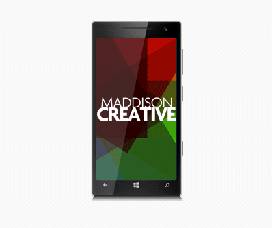
This is why most clients want a 'mobile-first' approach to their website, whereby you ensure that everything looks and behaves beautifully on a mobile device before considering a desktop version, and if something has to compromise, it certainly won't be the mobile site.
A 'responsive' website is one that adapts to the device it's being viewed on, whether that is a desktop computer, a mobile phone or a tablet. The content is then displayed in a way that is optimized for said device, improving user experience.
How have mobile devices influenced web design, and what are responsive websites?
Two in every three minutes spent online are spent by users using a handheld mobile device (phone/tablet), while thirteen percent of adults in the United Kingdom browse the web only on their mobile phone, whereas 11 percent browse the web only on their desktop which highlights the trend in the diminishing reliance on desktop computers in favour of mobile devices. Over the last two years, tablet use to browse the internet has increased by around 33%, whereas in the same time frame mobile use in browsing the web has increased by almost 80%, whereas desktop use in browsing the web has diminished.
This has influenced the way that web designers are now required to build websites. Because of the high likelihood that someone who arrives at your site will be using a mobile device, it is now the norm to design for 'mobile first', which means that everything functions and renders beautifully on a mobile device first and foremost, and then secondarily we will consider how it looks and feels on a desktop. It seems like a long time ago that companies were happy for users to browse the full version of their website on their smartphone, having to scrollabround the page and zoom into areas they were interested in looking at in closer detail, struggling to navigate using tiny text hyperlinks.
One practice, when smartphones were becoming popular, was to create a totally separate version of your site for mobiles, but as technology has developed it is now possible to use css to adapt your website to the device it is being viewed upon, so the user is effectively seeing exactly the same page irrespective of their device, it is just rendered differently because it is pulling in different styles. A website built in this way is known as 'responsive'.
More answers to web design questions...
Where to next?
Web Design | Online Advertising | Interactive Design | Email Design | Graphic Design | Video & Animation | Brand & Creative | Training | Design Consultancy